Little Blossom: A Joyful Display Font for Digital Design
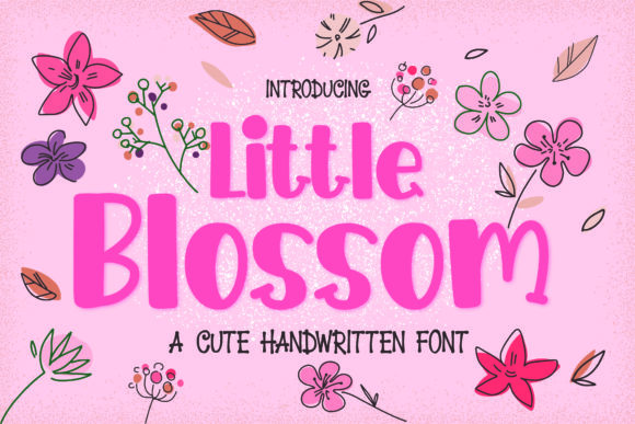
As a web designer who builds landing pages, SaaS dashboards, and boutique e-commerce experiences, I reach for display fonts not just for decoration—but for intention. Little Blossom is one of those rare typefaces that delivers immediate warmth without sacrificing clarity or digital legibility. It’s a whimsical, hand-drawn-inspired display font with gentle curves, playful baseline variations, and subtle bounce—designed to evoke youth, sincerity, and lighthearted energy. But unlike many decorative fonts, Little Blossom holds up remarkably well in real-world UI contexts when used thoughtfully.
Its personality shines brightest in hero sections, brand headers, and conversion-focused CTAs—especially where emotional resonance matters more than dense information. Think of a children’s learning app launching a new course, a floral subscription service welcoming visitors on its homepage, or a creative coach using a soft, uplifting tone across their digital presence. In each case, Little Blossom communicates tone before the first sentence is read. That’s powerful—not because it replaces strong copy, but because it aligns visual language with voice at the very top of the viewport.
For readability, it’s essential to treat Little Blossom as a strategic accent—not body text. It has no lowercase alternates, no italic variants, and minimal weight options (typically one upright style). That makes it ideal for short, high-impact phrases: “You’re Invited,” “New Collection,” “Start Your Journey,” or “Just for You.” On mobile, keep letter spacing generous and minimum sizes at 28px for headlines—even larger on hero banners—to preserve its delicate charm without sacrificing scannability. Avoid tight tracking or all-caps usage, which can flatten its natural rhythm.
When layered over imagery—like soft-focus lifestyle photos or pastel gradients—Little Blossom performs best with solid background overlays (30–50% opacity white or off-white) or subtle stroke effects for contrast. On dark mode interfaces, use a clean white or cream fill with soft drop shadows instead of bold outlines, which can feel heavy against its airy structure. Never stretch or distort the font—it loses its organic character instantly.
Pairing is where Little Blossom truly earns its place in your design system. Use it alongside a neutral, highly legible sans serif like Inter, Manrope, or Poppins for body copy, navigation, and form labels. This contrast reinforces hierarchy: Little Blossom sets the mood; your workhorse sans carries the message. For editorial or premium brand sites, consider pairing it with a warm, low-contrast serif like Cormorant Garamond or Literata—just avoid overly ornate serifs that compete for attention. The goal is harmony, not tension.
In practice, I’ve used Little Blossom across several digital product types with consistent success:
- Creative portfolios: As a nameplate or section divider—small, centered, and spaced generously above project thumbnails.
- Boutique online stores: On seasonal banners (“Spring Arrivals”), limited-edition tags, or handwritten-style product highlights.
- Coaching & course websites: In welcome modals, milestone badges (“You Did It!”), or testimonial pull-quotes.
- SaaS onboarding flows: For friendly step headers (“Let’s Get Started”)—paired with clean UI icons and minimalist buttons.
- Digital brand kits: As the primary display element in logo lockups, social media story templates, and email headers.
It’s not suited for long paragraphs, data tables, or dense navigation menus—and that’s by design. Its strength lies in brevity and emotional punctuation. When used outside its scope—say, as button text smaller than 18px or in a sticky header that shrinks on scroll—it begins to lose impact and risks appearing unpolished.
From a technical standpoint, most Little Blossom webfont packages include WOFF2 files optimized for fast loading, basic Latin character support (including accented characters for French, Spanish, and German), and OpenType features like ligatures and stylistic alternates. Always verify multilingual needs early—if your audience includes Turkish, Vietnamese, or Cyrillic readers, check glyph coverage before committing. Also confirm whether the license permits self-hosting on client sites, embedding in Shopify themes, or inclusion in Figma design systems. Most commercial licenses cover standard web use, but template reselling or SaaS platform integration often requires an extended license.
One practical note: if you're building reusable components—like Figma UI kits or WordPress block themes—test how Little Blossom renders across browsers. Safari sometimes applies extra anti-aliasing to decorative fonts, making them appear slightly blurrier than in Chrome or Firefox. A tiny text-rendering: optimizeLegibility; tweak (used sparingly) can help—but only after verifying it doesn’t interfere with responsive scaling.
Ultimately, Little Blossom isn’t about adding “cute” to a layout. It’s about choosing a display font that reflects a brand’s emotional intelligence—where playfulness serves purpose, not just aesthetics. It works because it feels human-made, not algorithmically generated. In an ecosystem saturated with ultra-thin geometrics and rigid neo-grotesques, a font like this brings balance: warmth without clutter, joy without noise, personality without pretense.
Use it where you want users to pause, smile, and feel invited—not instructed. That small shift in tone, supported by smart typography choices, often moves the needle more than any headline rewrite or CTA color change.